Information is perceived easier if presented visually. One way to present reports, plans, indicators and other types of business material - graphics and charts. In analytics, these are an indispensable tools.
Build a schedule in Excel according to the table you can in several ways. Each of them has its advantages and disadvantages for a specific situation. Consider everything in order.
The simplest schedule of change
The graph is needed when it is necessary to show data changes. Let's start with the simplest chart to demonstrate events at different intervals.
Suppose we have data on net profit of the enterprise for 5 years:
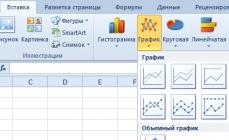
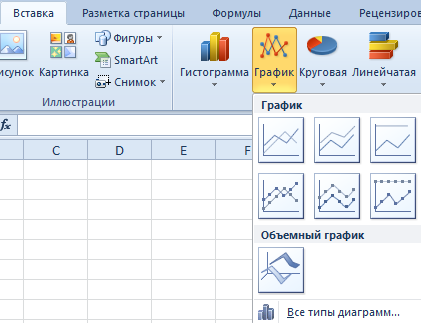
* Conditional figures for training purposes.We go to the "Insert" tab. Several types of diagrams are offered:
Choose a "schedule". In the pop-up window - his appearance. When you guide the cursor on this or that type of chart, the hint is shown: where it is better to use this schedule for which data.
Selected - copied the table with the data - inserted into the diagram area. It turns out this option:
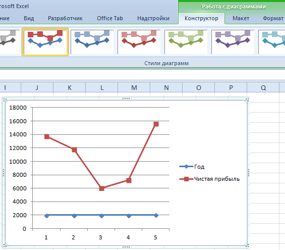
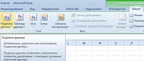
Direct horizontal (blue) is not needed. Just allocate it and delete it. Since we have one curve - legend (to the right of the schedule), too, we also clean. To clarify information, sign markers. On the "Data Signatures" tab, determine the location of the numbers. In the example - right.
Improve the image - sign the axis. "Layout" - "name of axes" - "Name of the main horizontal (vertical) axis":
The title can be removed, move to the chart area, above it. Change style, make fill, etc. All manipulations - on the "Diagram Title" tab.
Instead of the ordinary issue of the reporting year, we need one year. Select the values \u200b\u200bof the horizontal axis. Right-click - "Select Data" - "Change Signatures of the Horizontal Axis". In the Opening tab, select the range. The table with the data is the first column. As shown below in Figure:
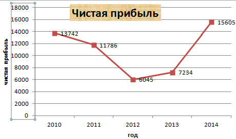
We can leave the schedule in this form. And we can make a fill, change the font, move the diagram to another sheet ("Designer" - "Move the chart").
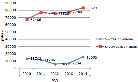
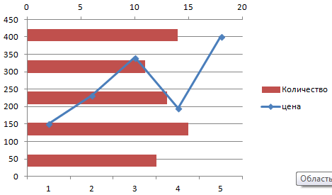
Schedule with two and more curves
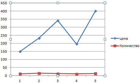
Suppose we need to show not only pure profits, but also the cost of assets. Data has become more:
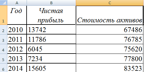
But the principle of construction remained the same. Only now makes sense to leave a legend. Since we have 2 curves.
Adding a second axis
How to add a second (extra) axis? When the units of measurement are the same, use the instruction proposed above. If you need to show data from different types, you will need auxiliary axis.
First we build a schedule as if we have the same units of measurement.
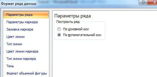
Select the axis for which we want to add auxiliary. The right mouse button is "the format of a number of data" - "parameters of the row" - "according to the auxiliary axis".
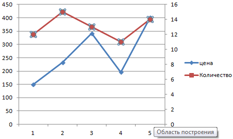
We press "close" - the second axis appeared on the chart, which "adjusted" to the curve data.
This is one of the ways. There is another - changing the type of diagram.
Click right-click on the line for which an additional axis is needed. Choose "Change the type of chart for a number".
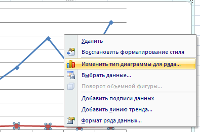
We are determined with the view for the second row of data. In the example - a line diagram.
Just a few clicks - an additional axis for another type of measurement is ready.
Build a schedule of functions in Excel
All work consists of two stages:
- Creating a table with data.
- Building a graph.
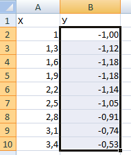
Example: y \u003d x (√x - 2). Step - 0.3.
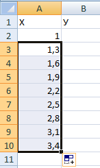
Making a table. The first column is x. Using formulas. The value of the first cell is 1. The second: \u003d (first cell name) + 0.3. We highlight the right lower corner of the cell with the formula - pull down as much as you need.
In the column, we prescribe a formula for calculating the function. In our example: \u003d a2 * (root (A2) -2). Click "Enter". Excel counted the value. "Specify" the formula throughout the column (pulling over the right lower corner of the cell). Table with data is ready.
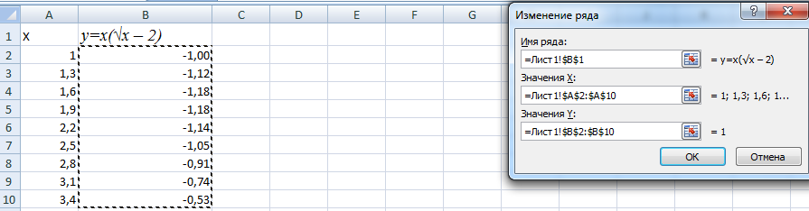
Go to a new sheet (you can stay on this - put the cursor in the free cell). "Insert" - "diagram" - "point". Choose the type you like. Click on the chart area with the right mouse button - "Select Data".
Select x (first column). And click "Add". The "Changing Row" window opens. We specify the name of the row - the function. X values \u200b\u200b- first column table with data. Values \u200b\u200by - second.
Click OK and admire the result.
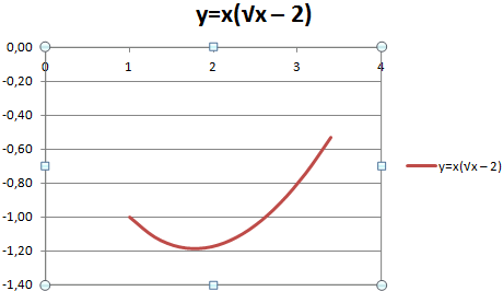
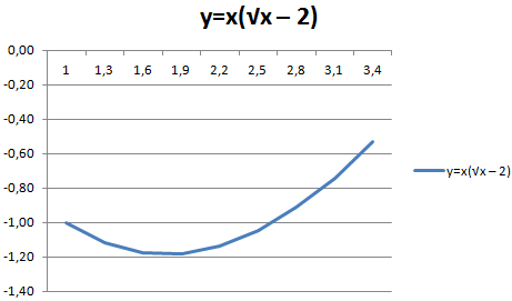
With the axis, everything is in order. On the axis x there are no values. Only dot numbers are affixed. It needs to be corrected. It is necessary to sign the axis of the graph in Excel. Right Mouse Button - "Select Data" - "Change the signatures of the horizontal axis". And highlight the range with the desired values \u200b\u200b(in the table with data). The schedule becomes such what should be.
Overlay and combining charts
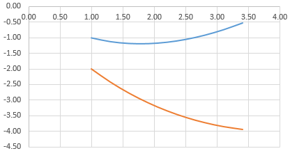
Build two graphics in Excel does not represent any difficulty. Compatible on one field two graphics of functions in Excel. Add to previous z \u003d x (√x - 3). Table with data:
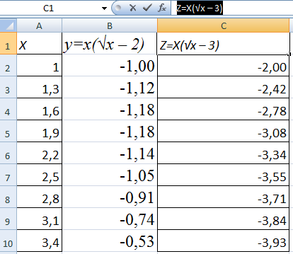
We highlight the data and insert in the diagram field. If something is wrong (not the names of the series, the numbers on the axis were incorrectly reflected), edit through the "Select data" tab.
But our 2 graphics of functions in one field.
Graphs addiction
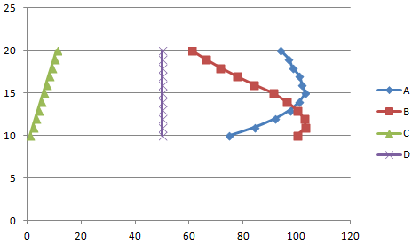
The data of one column (strings) depends on the data of another column (string).
Build a chart of the dependence of one column from another in Excel, this is true:
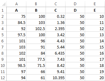
Conditions: A \u003d F (E); B \u003d F (E); C \u003d F (E); D \u003d F (E).
Select the type of diagram. Point. With smooth curves and markers.
Selecting data - "Add". The name of the row is the values \u200b\u200bof x - values \u200b\u200bof A. Values \u200b\u200bin E. again "add". The name of the row is V. Values \u200b\u200bX - data in column B. Values \u200b\u200bof y - data in the E. column and for this principle the entire table.
In the same way, you can build ring and bar charts, histograms, bubble, stock exchange, etc. Excel features are diverse. It is enough to vividly depict different types of data.